Stackla releases new UGC widgets
via stackla.com
Showcasing authentic user-generated content in a way that’s both on-brand and engaging on your website has been a staple use case for Stackla customers from day one. All our Widgets come with some pretty sweet designs out-of-the-box, plus tools to customize everything from fonts and colors, to sharing tools, comments and ShopSpots.
Every Widgets style comes with code editors built in that ensure you can customize them to achieve your desired style and behavior using CSS and JavaScript. However, your time is valuable, so we’ve focused on building a variety of out-of-the-box displays to reduce the need for you to spend time cutting code.
Take a look below at Stackla's three newest Widgets: Nightfall, Quadrant and Slider.
Slider
Hot off the press, Slider officially went live on all customer stacks today. Slider’s asynchronous transition was designed to add some visual interest when a user loads more content. The vertical scrolling Widget is optimized for displaying all types of content in a fixed number of rows.
Nightfall
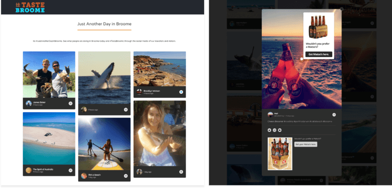
Nightfall brings a slick, dark feel to the very popular, vertical scrolling masonry pattern. We’ve not only toned the color palette down, but we’ve also simplified the inline tiles so the content can be the star.
Our friends at Unique Kimberley’s #TasteBroome are showing off some of the great content travelers are posting in Australia’s Top End. ShopSpots appear over the expanded images to link content to relevant offers.

Quadrant
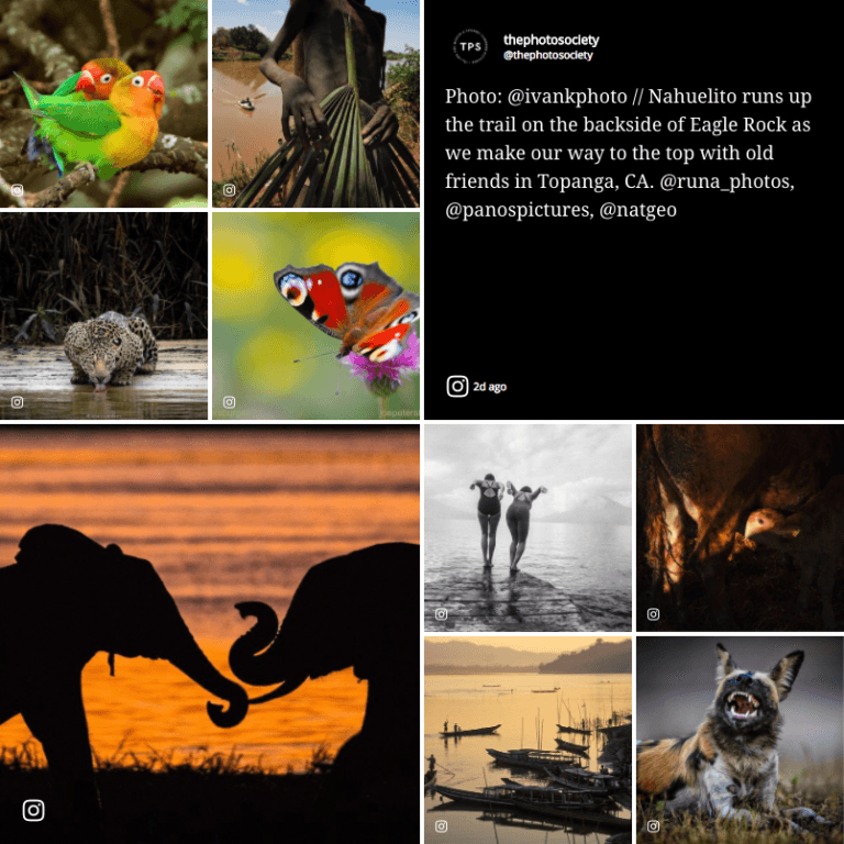
The inspiration for Quadrant came from grid-style print publications, journals and magazines. We wanted to design something with variation in tile size that effectively presented both image and text-only styles. The result is a beautiful new Widget that features a grid of small and large tiles that alternate positions when they load to create a checkerboard effect. It’s both eye-catching and great for displaying all types of content (image, video and text).


